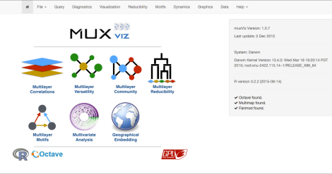
MuxViz is a platform for the analysis and visualization of multilayer networks. It is based on R (providing basic functionalities and the GUI) and Octave (providing a fast analysis engine for linear algebra calculations).
In this small tutorial we will show how to use muxViz to work also with classical (single-layer) networks. This is the very first post about how to use muxViz, therefore I will dedicate a section to preparation of data. If you are already familiar with formatting data for muxViz and how to import them, you can skip the first part and jump directly to the visualization section of this post.
Preparing the data
The preparation of input files is very easy. MuxViz requires plain text ASCII files to work, with columns separated by some special character (e.g. backspace, “,”, “;”, etc). At least three files are required:
- A configuration file, where path(s) to network(s) data are specified;
- A layout file, where information about nodes is specified;
- An edge-list file, where edges are specified (for edge-colored networks, one file is needed for each layer; for interconnected networks an extended edge-list format can be used)
In the following we will cover the case of both single-layer and edge-colored network models, by examining the dataset of Florentine families during the Renaissance period (about 1400-1500 AD).
There are two types of relationships in the dataset: marriage alliances and business alliances. One can analyze and visualize the corresponding edge-colored network with 2 layers, where each layer corresponds to a type of alliance, or one can be interested in analyzing the aggregate network obtained by summing up all the connections from the two layers, to obtain a classical single-layer network.
In principle, one can create and store the data everywhere in the system. However, for simplicity, here we will work within the muxViz folder.
Aggregate (single-layer) network
- In the
data
folder inside muxViz’s one, create a folder
Florentine
- In the new folder, create the edge-list file (simple ASCII text) with your network data, here we name it
Florentine-Families_aggregate.edges
where each line (with format: node node weight) should look like
1 9 1
- In the same folder, create the layout file (simple ASCII text), where one can define information about nodes (e.g., ID, label, geographic location, etc). Here we use (note: the header is mandatory in this file):
nodeID nodeLabel
1 ACCIAIUOL
2 ALBIZZI
3 BARBADORI
4 BISCHERI
5 CASTELLAN
6 GINORI
7 GUADAGNI
8 LAMBERTES
9 MEDICI
10 PAZZI
11 PERUZZI
12 PUCCI
13 RIDOLFI
14 SALVIATI
15 STROZZI
16 TORNABUON
- Finally create the configuration file
Florentine-Families_aggregate_config.txt
with your favorite editor (simple ASCII text) to tell muxViz where the input network is located and which layout you want to use; in this case
data/Florentine/Florentine-Families_aggregate.edges;Florentine Alliances;data/Florentine/Florentine-Families_layout.txt
Edge-colored (double-layer) network
The procedure is very similar to the previous one, with the only difference that now more than one layer must be specified. In particular, only points 2. and 4. require some additional work.
In the same folder as before, create the two new files
Florentine-Families_marriage.edges
Florentine-Families_business.edges
each one containing the edge-list encoding connections between Florentine families in Marriage and Business alliances, respectively. Finally, let us create a new configuration file
Florentine-Families_multiplex_config.txt
with just two lines, to specify the paths and the attributes for each layer separately:
data/Florentine/Florentine-Families_marriage.edges;Marriage Alliances;data/Florentine/Florentine-Families_layout.txt
data/Florentine/Florentine-Families_business.edges;Business Alliances;data/Florentine/Florentine-Families_layout.txt
Importing the data into muxViz
To run muxViz, first run R (e.g. from your Terminal), navigate into the muxViz folder and then type the following command:
source("muxVizGUI.R")
If muxViz has been downloaded correctly, the following page should appear in the browser:
For this tutorial, Octave and other external tools are not really needed. Nevertheless, I will use them to make nicer plots later.
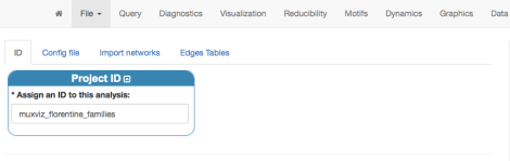
To import the data for your aggregate network, use the menu “File” > “Import”. First, assign name to the project (this is optional, a default one will be used otherwise)
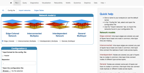
Specify the type of network you are going to work with: in this case it is an Edge-Colored Network. Even if you import the aggregate network, it can be considered as a single-layer edge-colored network. Successively, specify the location of your configuration file by using the “Browse” button.
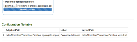
If the configuration file is correct uploaded, the following should appear at the end of the page:
To finalize the importing procedure, let us select the “Import networks” tab and, after setting up the type of network (undirected and weighted) as well as the input Format (in this case, default values are fine), we click “Import Network”.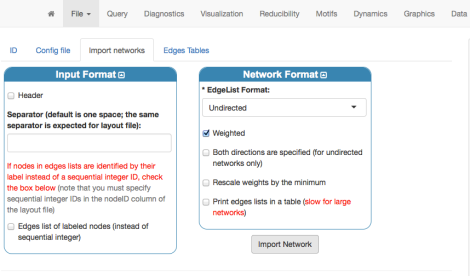
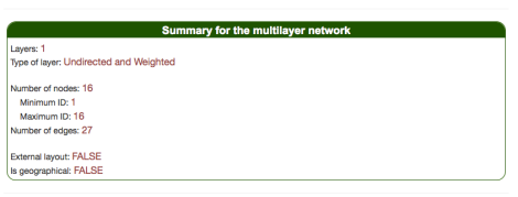
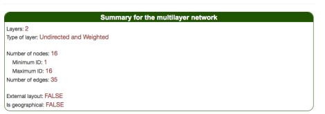
If input data were formatted and imported correctly, muxViz will show this summary at the end of the page.
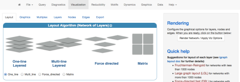
Visualizing networks in 3D
To visualize a network, in general we have to:
- Apply a layout algorithm (to the network of layers and to each layer), to embed the nodes onto a plane or into a 3D space;
- Adjust the graphical options for nodes, edges and layers
- Render the visualization
The above operations can be performed from the “Visualization” space.
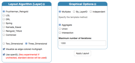
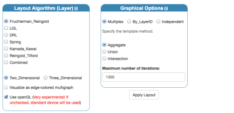
To visualize a single-layer network in 3D we have to select the “One-line Layered” layout, first of all (note: depending on the usability of this and feedbacks, I could consider the possibility to add a dedicated icon for this purpose). Second, we have to choose the layout algorithm for each layer: here, we use the three-dimensional Fruchterman-Reingold. It is important to check
- “Visualize as edge-colored multigraph”
- “Use openGL” (this is generally checked by default)
For single-layer networks the graphical options on the right-hand side do not have impact on the final rendering.
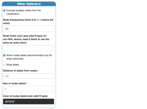
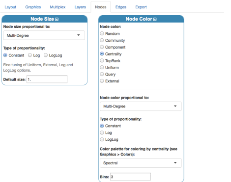
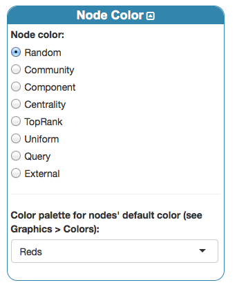
Before rendering, we can just set up basic coloring, sizing and labeling for nodes from the panel “Nodes”:
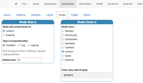
Finally, by clicking “Render Network”, on the right-hand side, we obtain the 3D visualization of the Florentine families network data:
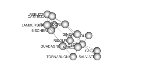
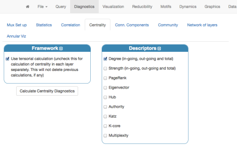
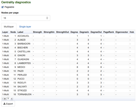
that can be explored interactively (rotate and zoom). Of course, this visualization can be improved. For instance, we can calculate the degree centrality of each family and then assign color and size according to this descriptor. Centrality can be calculated from the “Diagnostics” menu:
and, if everything went fine, the following table should appear:
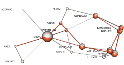
Let us click again “Visualization” menu and change a little bit nodes’ settings, to exploit centrality measures:
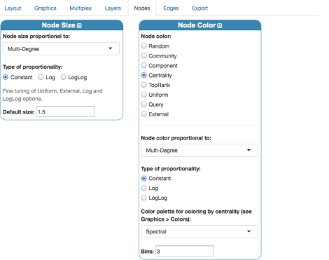
Note that “multi-degree” here coincides with the standard degree centrality, because there is only one layer in our Edge-colored model. The number of bins sets the number of degree categories: here, I use 3 to encode the simple pattern very important, important, less important. The final rendering should look like
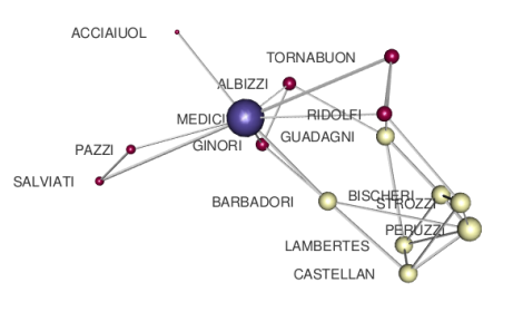
that is much better than before and more clearly indicates the importance of Medici family in that period.
Layered visualization of the edge-colored network
The multiplex network data can be imported by using the same approach previously explained, with the only difference that in this case the file
Florentine-Families_multiplex_config.txt
must be uploaded. If everything is done correctly, the following summary should appear at the end of the page:
We have to modify a bit the settings for layout algorithms:
unchecking the edge-colored multigraph visualization in favor of a 2D layered visualization. A few settings have to be tuned to reach a good rendering, in the following I will use one possible set of values. In the “Graphics” tab let’s reduce the space between layers and the overall scale:
Apply the layout settings, by clicking “Layout”. Now let us change settings for nodes:
where a negative value of the distance allows us to display nodes’ labels on the correct side of the plot. Finally, we obtain
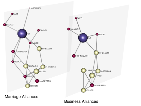
By setting again a 3D edge-colored multigraph visualization, and coloring nodes according to their layer by
we obtain
where it is easy to identify families and alliances existing in both layers.
The current visualization can be exported to a standalone WebGL, embedded in a standard HTML page, from “Export” tab
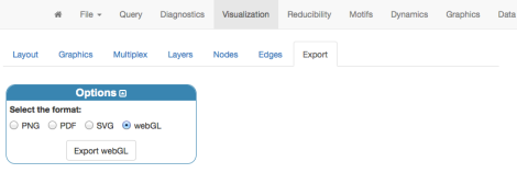
to share your visualization(s) with the rest of the world! The result will be exported into the
export
folder, within muxViz’s folder.
Unfortunately, given the current security limitations of the wordpress.org platform, I can not include the resulting WebGL into this post, because it includes some javascript. Of course, you will not have such limitations if you want to embed the WebGL into your own website.

Manlio, this post looks really useful!
Any news about museums and art? 🙂 I would love to see that when it is available.
LikeLike
Hi Mason, thank you!
I think it is the best way to show muxViz’s potential for analysis and visualization.
I completed the work for the museum some weeks ago. To the best of my knowledge they are building the visualization(s) in this period. When I will know something more, I will let you know 🙂
LikeLike